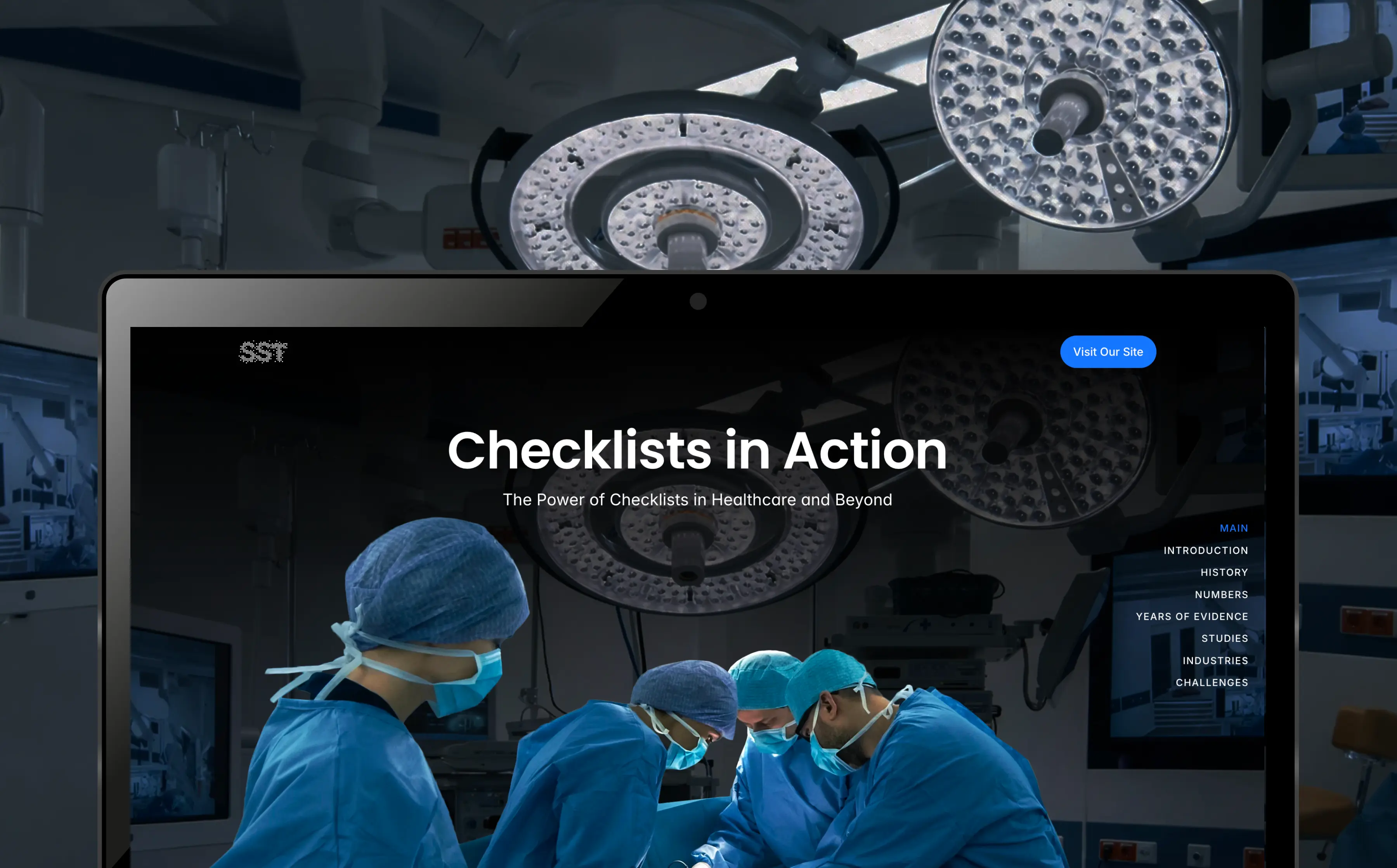
HEALTHTECH COMPANY
Created an interactive tool highlighting the significance and impact of the Surgical Safety Checklist
Roles
Visual Design
Art Direction
Web Design
Content Design
Overview
Impact
End-to-end
project ownership
9-12 mins
6.5%
The Challenges

Distilling down information for highest impact
Content needed to be easily scannable and quick to read, while remaining engaging and structured for search visibility.

Creating a clear narrative flow for users
The experience needed to maintain user engagement while guiding users toward the main website.
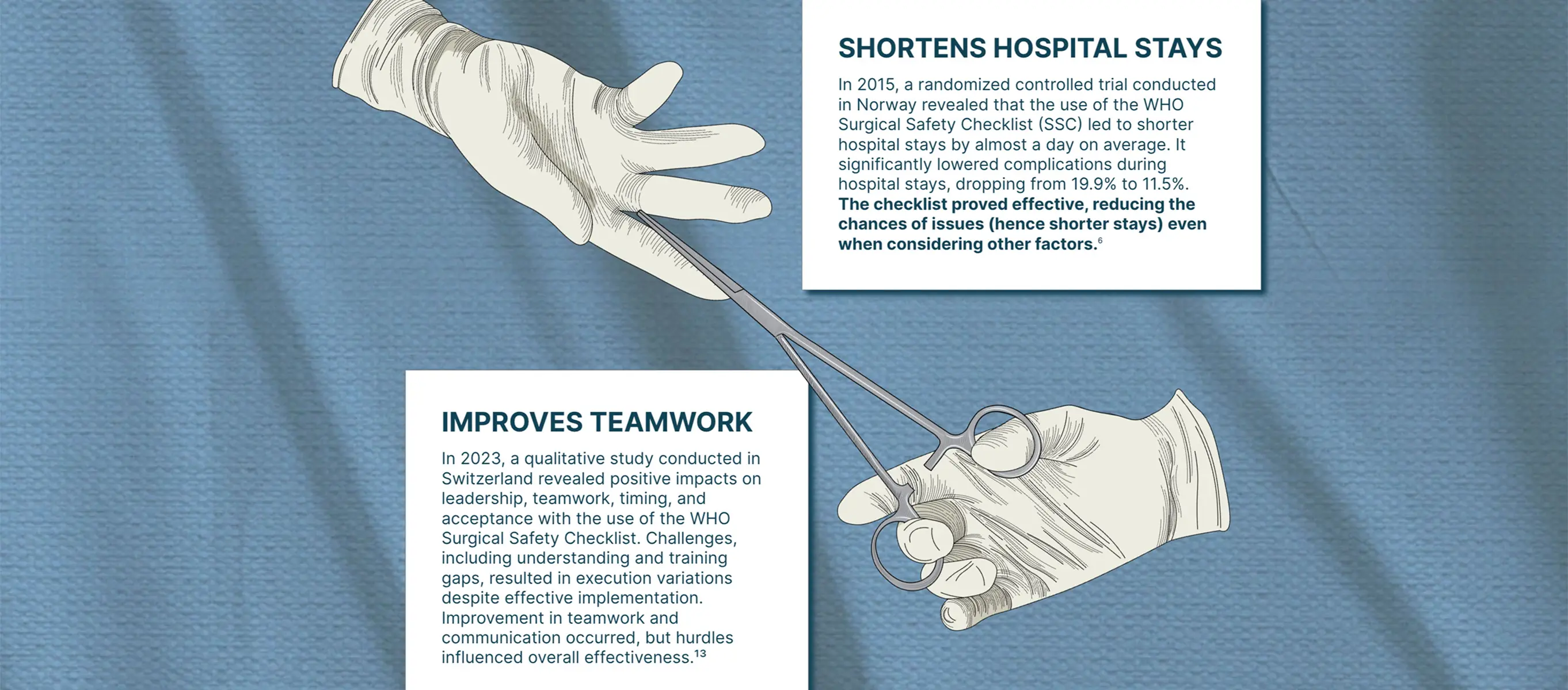
Rebuilding the experience following a rebrand
The project was initially designed using an illustrative style aligned with the previous brand, requiring a full visual transformation following the rebrand.

Improving usability for quick navigation
The microsite contained dense information, making it difficult for users to navigate between sections across web and mobile.
Discovery
The goal was to create an engaging, interactive, and easily shareable marketing tool for internal and external stakeholders. A microsite was selected as the most effective format to support these objectives. Using literature, academic papers, and existing research, I translated complex information into clear, structured sections.


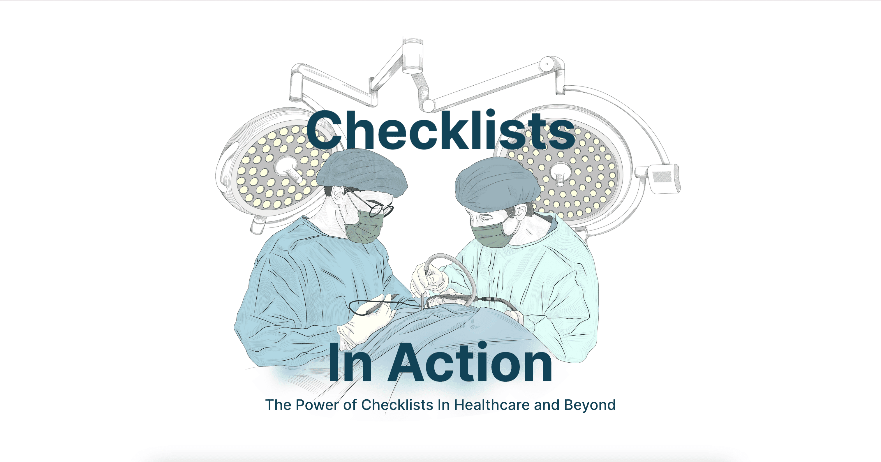
The initial design followed an illustrative style aligned with the company’s previous brand.



New Direction
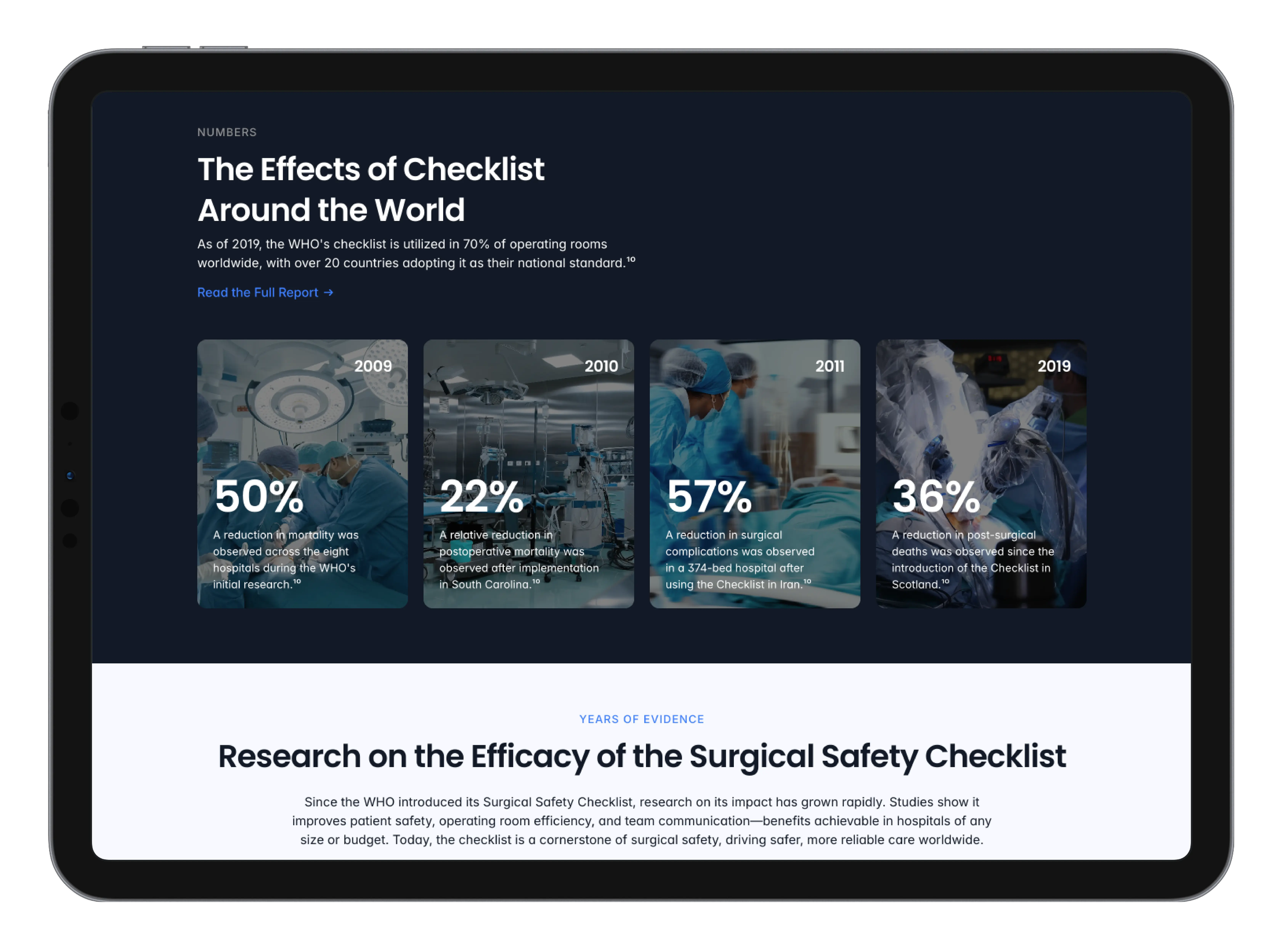
Following the rebrand, the checklist microsite was redesigned to align with the updated brand system. This included replacing illustrative elements, introducing a new color palette, new typography and integrating the experience into the broader site architecture.

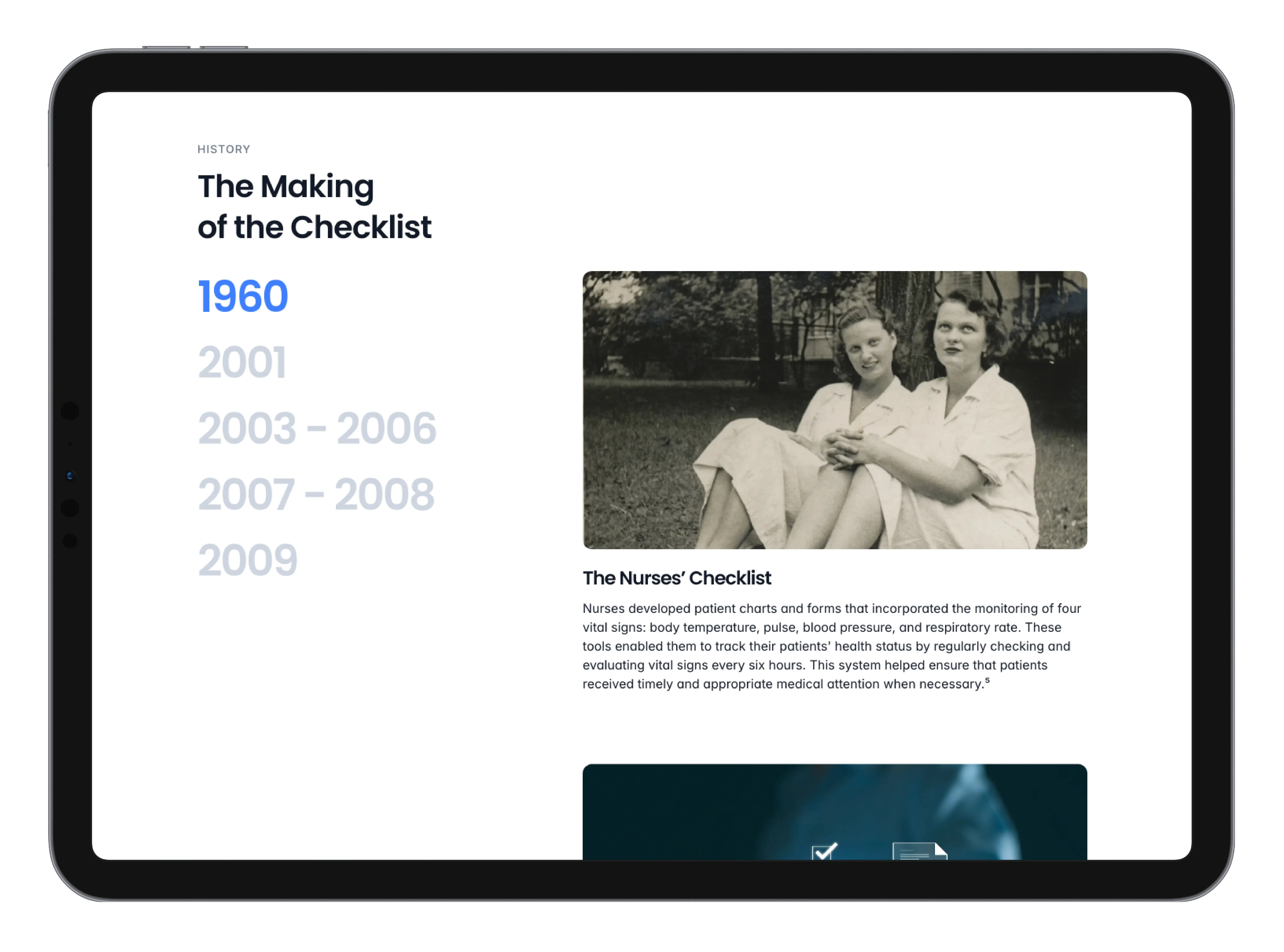
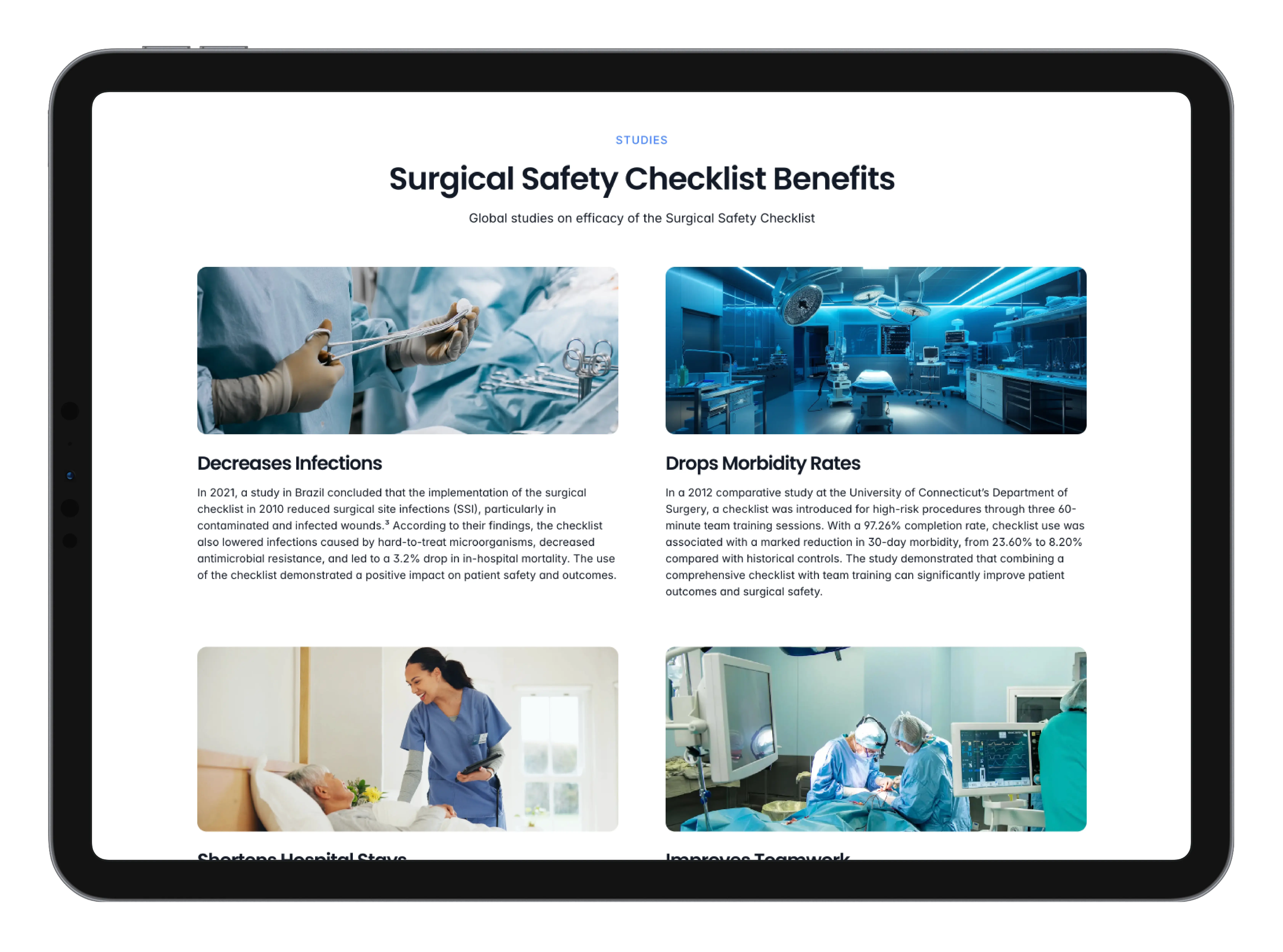
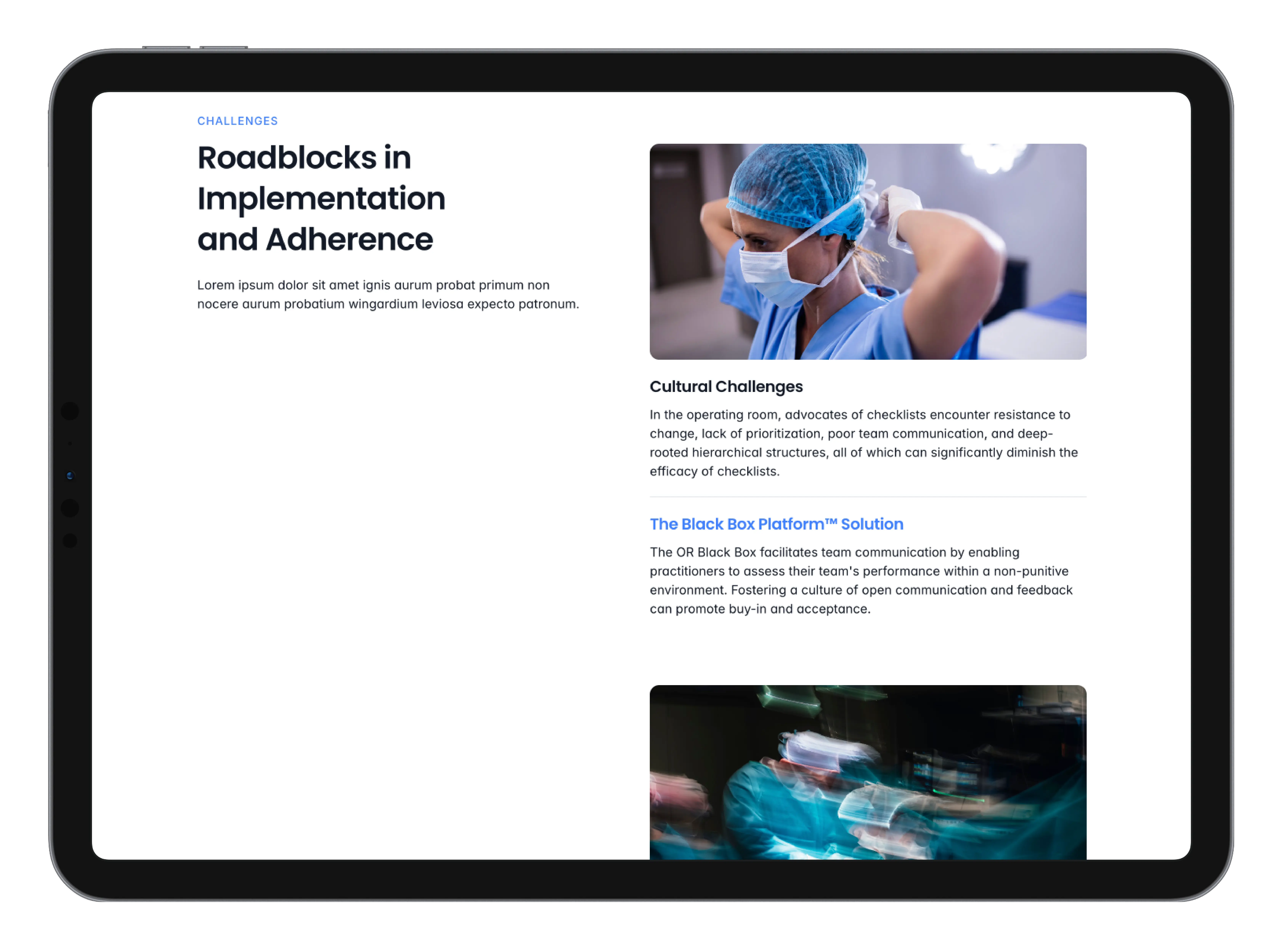
The Final Result
The microsite integrates with the broader website while establishing a distinct visual and interaction approach as a marketing and educational tool.
